Synoptic charts consist of curved lines drawn on a geographical map in such a way as to indicate weather features. The curve lines are known as isobars (lines of equal pressure) drawn around depressions (lows) and anticyclones (highs).
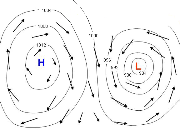
Air moves from high to low pressure along a gradient. If the high pressure system is close to the low pressure system, or the pressure difference between high and low is great, then there is a steep pressure gradient and the air will move fast. This is shown on a synoptic chart with isobars that are very close together and we feel strong winds as a result.
Other features often seen on a synoptic chart are fronts and troughs. These are drawn to highlight the areas of most significant weather, but that does not mean that there is nothing of significance elsewhere on the chart.
Anticyclones are areas of high barometric pressure at its centre, whose centres are often less well defined than depressions, and are associated with calm, settled weather. They are areas of sinking air. Winds blow in a clockwise direction around anticyclones in the northern hemisphere, this is reversed in the southern hemisphere.
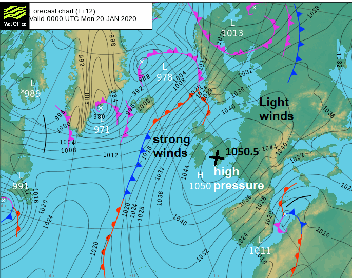
Depressions are areas of low barometric pressure at its centre, usually with a well-defined centre, and are associated with unsettled weather. Air rises in the centre of lows. Winds blow in an anticlockwise direction around depressions in the northern hemisphere, this is reversed in the southern hemisphere. Depressions are often accompanied by frontal systems.
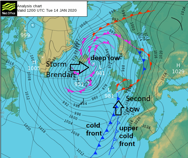
In the northern hemisphere air moves around high pressure in a clockwise direction and low pressure in an anticlockwise direction. So, following the lines and spacing of the isobars you can get a rough idea of the direction and strength of wind flow over a particular area. Though it should be noted that winds often don’t blow parallel to isobars, rather are deflected slightly across isobars towards the centres of low pressure or away from centres of high pressure.
Cold fronts are shown by a blue or black line and blue triangle, the side of the front the triangles are on is the direction the front is travelling towards. They mark the leading edge of a change to a colder airmass, though sometimes the passage of the front may not be particularly marked temperature wise at the surface. A cold front often produces cloud and rain or snow and is marked by a change in wind direction, though when the fronts are weak they may only just produce cloud or just a change in airmass and wind direction under blue skies.
![]()
Warm fronts are shown by a red or black line and red-semi circles, the side the semi circle is on is the direction the front is travelling towards. They mark a change to a warmer airmass, with warmer air following the front. Warm fronts tend to produce cloud and rain, though not always rain.
![]()
Upper cold/warm fronts represent the boundaries of different airmasses at levels above the surface of the atmosphere
![]()
![]()
Occlusions form when the cold front of a depression catches up with the warm front, lifting the warm air between the fronts into a narrow wedge above the surface. On an atmospheric pressure chart an occluded front appears as a purple or black line with a combination of blue triangles and red semi-circles or both symbols maybe purple. The side of the front the symbols are on is the direction in which the front is moving. Occlusions often produce rain or showers.
![]()
Developing or Weakening fronts
Sometimes a synoptic chart may show a warm or cold front developing (frontogenesis), this usually due to an increase in temperature gradient. It is denoted by the broken front and dots in between.
![]()
![]()
Sometimes a synoptic chart may show a warm or cold front weakening (frontolysis), often due to the front moving into an area of high pressure. It is denoted by broken front with crosses in between.
![]()
![]()
A black line with no triangles or semi-circles on a synoptic chart shows an area where the air is more unstable and showers are more likely to form.
![]()
This is a zone where winds from different directions converge,and often form lines of showers. They occur quite frequently down the Irish Sea in cold northerly outbreaks, affecting Wales, Devon and Cornwall. But do occur elsewhere too. They look like bare trees on synoptic charts.
![]()
Loading recent activity...