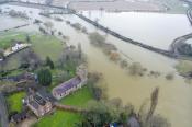



There has been a change to one part of the National Severe Weather Warnings. Many people will be familiar with the traffic-light-style yellow, amber and red colour levels which differentiate the warning areas we see on our UK weather maps and across Europe. The change is on the warnings matrix.
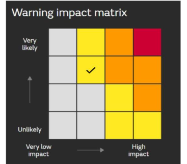 Old style warning matrix
Each time a warning is issued by the Met Office, there is also explanatory text to accompany the coloured area, and a matrix. This set should be viewed as a whole to fully understand upcoming severe weather.
The ‘warning impact matrix’ has shown likelihood against impacts, ranging from unlikely to very likely on one axis and very low impacts to high impacts on the other. The categories explaining what medium or high impacts from wind or heavy rain or snow relate to are all available on the UK Met Office’s website.
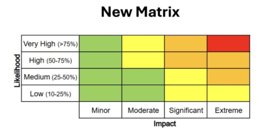 New style warning matrix
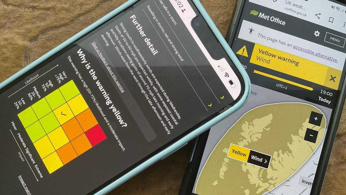
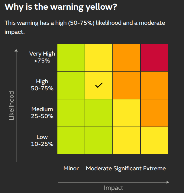
It is these matrix labels that have changed this month. We now have likelihood as low, medium, high and very high, with an accompanying percentage. The other axis shows impacts as Minor, Moderate, Significant, and Extreme.
The reason for this is to become more consistent between agencies and organisations when looking at potential impacts. This should help “align the picture of risk” and make it easier for users to interpret risk, aid understanding, which then leads to better decision-making and proportionate actions.
It will also correct where the colour categories sit on Google and Apple displays of international alerts/warnings. Previously, they were not being picked up correctly for the UK. These new labels of Moderate or Extreme merge into a wider European, even global network of severe weather warnings being displayed on phones. IT systems don’t translate the colour; they look for the word ‘Significant’ or ‘Minor’. This change should stop warnings being translated into the wrong category. The older Moderate and High labels did not match other countries' criteria in the Common Alerting Protocol (CAP)
World Meteorological Organisation “The WMO Common Alerting Protocol (CAP) is a universally standardised format for emergency alerts. CAP enables consistent communication across various channels in case of hazards. It allows alerting authorities to share alerts through multiple media, ensuring that critical emergency information is accessible to all.
CAP complements existing alerting systems by standardising multi-hazard early warning dissemination. It enables alerts to reach people through multiple channels simultaneously, increasing the likelihood that critical information is received promptly and effectively.”
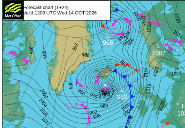
An example from mid October 2026
Yellow wind warning for NW Scotland as a significant low pressure moves by, which includes the remnants of Hurricane Isaias and will bring storm force winds to Iceland with blizzard conditions on the 14th.
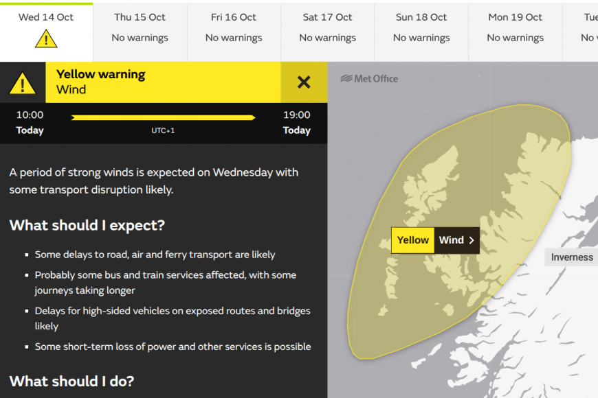
For our UK warnings, we have the map with coloured areas, the text and the matrix.
The text - Further detail (for NW Scotland area)
“Strong south to southwesterly winds are expected during Wednesday. Gusts of 50 to 60 mph are expected widely, with some exposed coastal and hilly locations seeing gusts of around 70 mph late morning and early afternoon. Winds ease from the west through the late afternoon and early evening.”MO
The new matrix
Iceland has warnings for wind and snow at yellow and amber levels, and Met Éireann has yellow warnings for wind and rain for northwestern counties.
So not much is changing apart from the matrix LABELS, which will help the technology in our phones and the international warning system to be consistent.
For Impacts: Very Low becomes Minor, High becomes Extreme. For likelihood: Very Low becomes Low, High becomes Very High and there will be a % against likelihood.
Loading recent activity...