


virtualsphere
-
Posts
695 -
Joined
-
Last visited
Content Type
Forums
Blogs
Gallery
Events
Learn About Weather and Meteorology
Community guides
Posts posted by virtualsphere
-
-
2010. Mainly for the December and to a lesser extent January, but June was also a very good summer month and I'd happily sacrifice the poor July & August for such an unusual winter.
-
 1
1
-
-
9.5C and 70mm please.
-
36.1C, Heathrow, July 29th.
-
 1
1
-
-
6.6C and 104mm please
-
raz.org.rain Re. Iberian heights, worth remembering we're coming off the back of an unusually strong Nino event so it's not unprecedented...

They'll probably disappear at some point, the question is how long we'll have to wait...
February?
March?
April?
-
4
-
-
4.6C and 52mm please
-
6.1C and 123mm please
-
1 hour ago, carinthian said:
... The "day after tomorrow " runs ( Monday ) with the weekend data added, will I dare say, cast some more light of this development and get some sort of consensus from the main models for a Christmas
 forecast,
For a moment there I thought you were referring to the film of the same name and was looking out for a run with some mega-Northerly and -40c 850s....
-
1
-
-
9th Feb 2007. We had deeper snow in 2010 but that fell over a longer period. Although we had a dusting on the 8th, this pretty much fell in a single afternoon. Unfortunately it rained the following day so there was little chance to make the most of it!
-
1
-
-
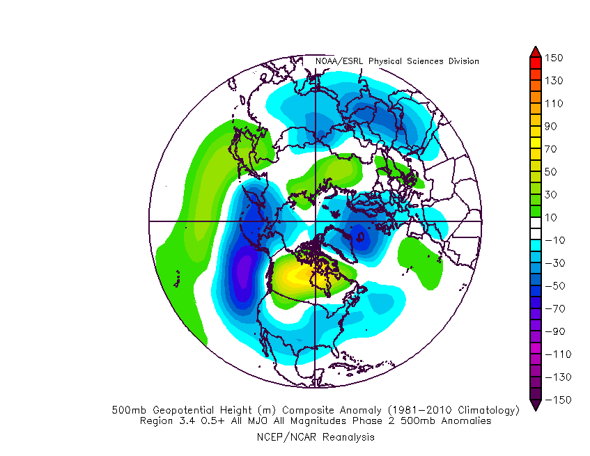
31 minutes ago, Uncertainty said:
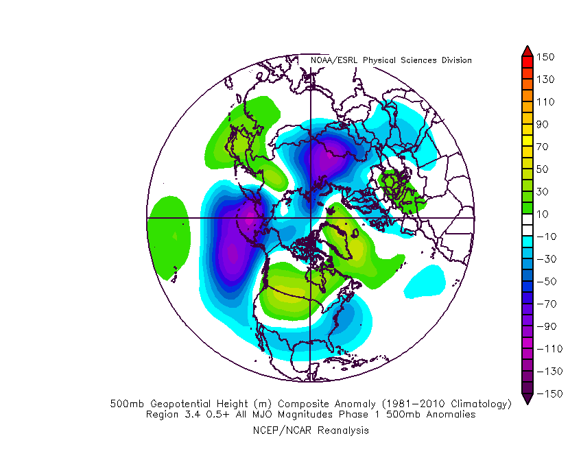
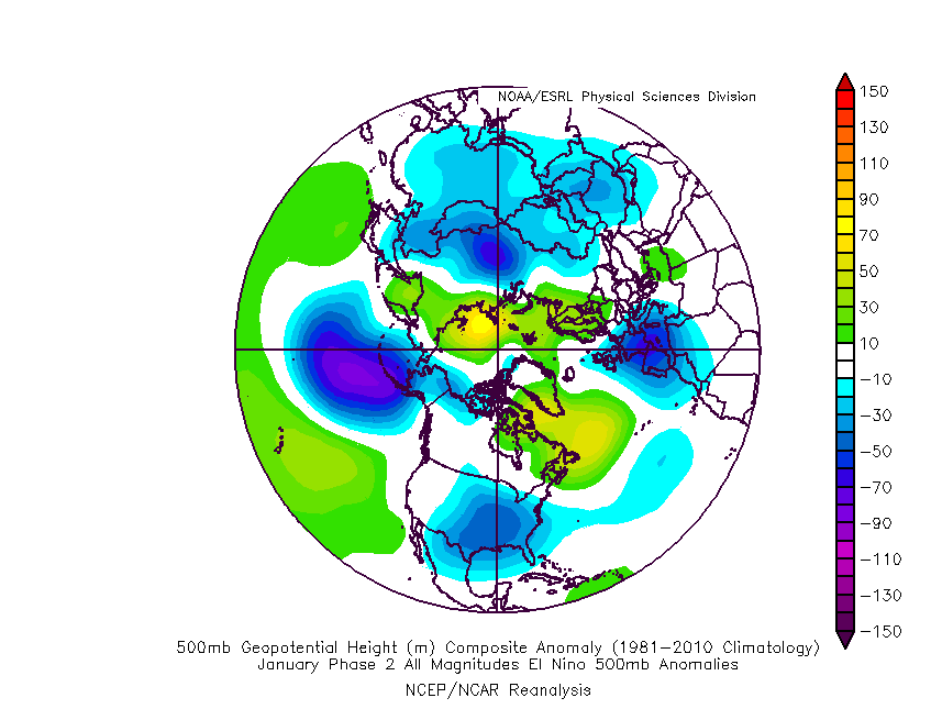
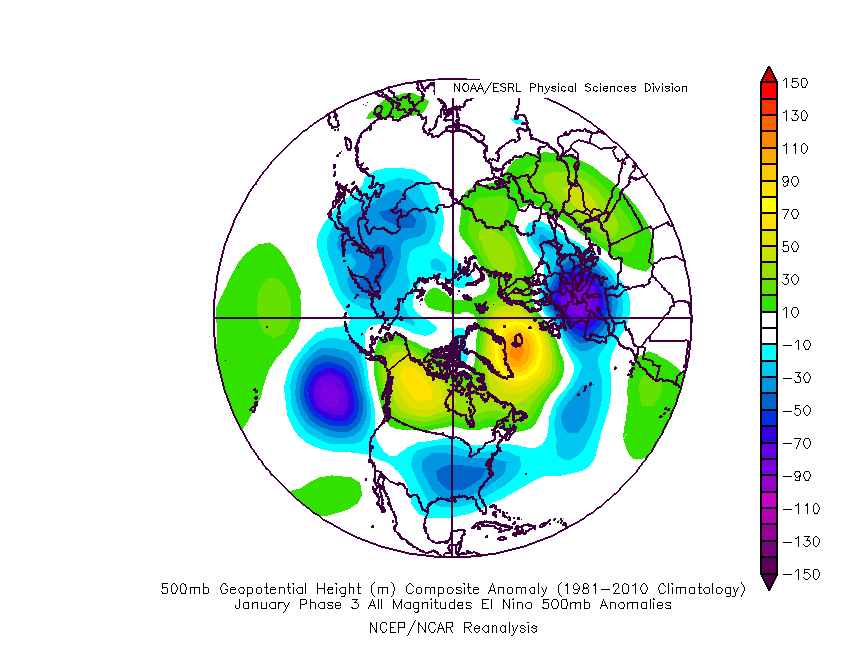
Looking a bit further ahead with that MJO modelling, if this persists we would be entering phase 1 towards the end of December. If the cycle continues with some amplitude, and allow for a few days response time, the Nino composites for 1-2-3 in January are certainly interesting and would fit with forecasts any colder spell to be more sustained after Christmas:
Compared to the December phase 2 which is what we're probably seeing play out in the more immediate modelling:
Obviously a long way to get there first!
-
3
-
 1
1
-
-
-
Looking at these long range models and given both the Nino and where we are in the solar cycle, it's intriguing that the Met Office are hinting at blocking to the NE rather than NW in their winter summary.
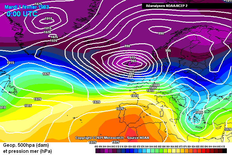
If we discount early winter, given the background seems to favour later winter blocking, looking at some previous Nino winters for Jan & Feb we get a block positioned to the NW (I picked out Feb 1983 as an individual example given the stronger ENSO signal).
This would also align with the solar research suggesting a general cycle of blocking NE at solar min (perhaps Feb 2009 / 2018 / 1986 etc) followed by further NW as the next cycle activity starts to pick up (1979 / 1987 / 2010 / perhaps last Dec etc). Of course you can argue that 1991 & 2013 which are closer to max are actually blocked back further NE.
Anyway, there seems from my very amateur perspective to be more signals for any block to be towards Greenland rather than Scandinavia...?
-
3
-
-
5 hours ago, CoventryWeather said:
Don't really know if anyone uses this chart, but interesting run on today's CFS according to this.
Shouldn't there only be one light blue and purple line each on the chart? Quite a difference there!
Edit - just spotted the same question posted on the model thread. I'm sure I've seen these graphs with only one set of lines before though.
-
1
-
-
Wet, but not out of the ordinary here in SW Wales, March was wetter as was last November and October 2019, with October 2021 coming close. I think the depressions taking a more southerly track and also passing further east through the UK have led to more of the country being affected by the rain this autumn, and possibly quite an unusual rainfall distribution for Scotland and N England with maybe as much or more rain in the east than the west. By comparison, Dec 2015 is by far the wettest month I've experienced in recent times whereas I think some eastern parts were fairly dry.
-
-
According to this, 2013 saw a bumper crop and that was ahead of a stormy wet winter rather than cold
Service unavailable
WWW.WOODLANDTRUST.ORG.UK-
1
-
1
-
1
-
-
13.5C and 128mm for me please. Given every value has been recorded before from 12.2 to the current record, along with the warmth we've seen in Sept and residual warmth over the ocean, I think we're in with a shot of beating 2001 this October.
-
The IOD forecast by UKMO at least appears to have been over-estimated. Looking at their ensembles from April, many were going for a peak between July and Sept in the 1.5C region with some exceeding 2C:
The Sept update shows the actual value to have been below 0.5C for much of that period and with a peak now expected at the end of the year but fewer members now touching the 2C ceiling on the chart.
(Source)
This latest chart seems similar to the latest BOM update posted by @Mike Poole on the previous page, though I'm not sure if you can view previous BOM runs in the same way to compare.
This wouldn't be on the scale of the two previous extreme IOD events from 2019/20 and 1997/98 which topped out with anomalies +3C, though the positive IOD periods closer to +2C in 1994/95 and 2006/07 were also rather uninspiring from a UK winter perspective. As others have posted there's not much data to go on though, and it's just one variable to throw into the mix.
(Source)
Of note this page suggests the IOD was positive in 1963 so make of that what you will... (though not necessarily the start of the year!) http://www.bom.gov.au/climate/enso/#tabs=Indian-Ocean&indian=History
-
2
-
-
Interesting discussion re. a possible correlation between warm Septembers and the following winter - thought I'd plot this to see if there's a visible link (1870 - 2022):
The very warmest examples do seem to be followed by warmer winters although there's a lot of scatter here. 1941 & 1880 are examples of 14.6C Septembers in El Nino followed by colder winters - add a bit of background warming on to Sept 1880 and similar synoptics may give us a 15C today perhaps? 1890 an even colder winter following a relatively warm Sept, though in La Nina. 1933 at 14.9 for Sept returns a following winter only just above 3C. Will be interesting to see where this month ends up.
-
2
-
2
-
-
13.5C and 71mm please
-
Some interesting charts already showing on this thread. Worth bearing in mind where we are in the solar cycle if we do get some northern blocking as the seasonals suggest. Solar max doesn't necessarily inhibit a cold winter spell but looking through the archives it does seem to sometimes be associated with more 'active' cold weather - think 1940, 1947, 1968/69, 1979, Feb 1991, Jan 2013 - rather than the persistently cold and dry blocking of say 2009/10, 1995/96, Feb 1986, 1963 or even early Jan 2021. A lot of those years were closer to ENSO neutral though. As mentioned in another thread, a 1968/69 setup might be worth a punt although I'm a bit wary of those Nino forecasts getting too strong.
-
Thanks @Mike Poole for the QBO data!
I've finally had time to revisit the graphs to plot this and I've also added SSW and solar activity data. The axis are the same as the previous charts I posted, i.e. ENSO (Sept-Nov mean for 3.4 region) vs CET, but this time I've highlighted QBO since 1953 with the colours representing SSW activity (red = earlier, think autumn, & green = later, think spring, & grey = no SSW) and the data point size representing sunspot numbers. The solar data doesn't indicate which part of the solar cycle each winter is in, which may be more influential than sunspot numbers alone, but thought it would be worth throwing in.
December - eQBO highlighted
This is quite colourful: there's more variation in SSW event timing throughout the whole of the Nov - March period in eQBO years. Larger shapes towards the centre indicates high solar activity may be associated with less extreme autumn ENSO conditions in eQBO years, while still producing a range of December CET outcomes. There aren't really any eQBO + strong El Nino + high sunspot examples, 1972 is probably the closest which was very mild.December - wQBO highlighted
Quite a difference with wQBO highlighted - SSW events seem to trend towards mid-late winter (Jan / Feb) and a greater range of ENSO extremes than in eQBO, while CET values cluster more towards average-mild than eQBO. Stronger El Nino and La Nina events have occurred with all levels of solar activity, unlike eQBO - if anything, with wQBO low solar activity seems to trend more towards ENSO neutral conditions in autumn. High sunspot levels in wQBO would seem to limit the December CET range to a minimum of around 3.5C.January
1979 being something of an outlier, wQBO is otherwise associated with much milder January CET values than eQBO. The strongest autumn El Nino values seem to be associated with particularly mild Januaries and the majority of these are wQBO and not associated with SSW event years. Under eQBO the strongest autumn Nino examples come in with January CETs around 1.5 and 4.5C, suggesting a colder mid-winter may be possible under current conditions, and all these winters featured a SSW although at different times of the season - caution advised though that these are all under lower solar activity and potentially weaker Nino conditions than currently forecast.February
Both eQBO and wQBO Februaries feature a wide range of CET outcomes. 1983 and 1956 show that colder Februaries are possible under wQBO conditions even following stronger El Nino or La Nina in the autumn and relatively high solar activity. 1991 and 1979 are examples of wQBO cold Februaries closer to ENSO neutral. Under eQBO the coldest Februaries trend closer to ENSO neutral and, apart from 1968 and 1969, tend to feature lower solar activity - at least in the limited timeframe of this dataset. The very few examples of stronger El Nino Feburaries under eQBO show mixed conditions - 2010 being coldest, 1973 average and 1966 mild, with 1973 closer in terms of solar activity although further into the descending part of the solar cycle than we are now.What does this suggest for the upcoming autumn and winter? If ENSO is in line with this dataset then either El Nino won't prove as strong as some forecasts project this autumn, or (assuming we stay in eQBO) we'll have an unsual combination of strong Nino + eQBO + higher solar activity which make it difficult to predict the outcome. Interesting to see above that the models have overestimated the El Nino strength so far.
At this point, purely based on this I'd probably plump for a mild December in line with 1972, colder January and some early warmth in February. If the Nino declines much more rapidly than predicted I'd go for the opposite and something akin to 1968-69 - colder start, mild middle and cold end. Of course anomalies like Jan 1979 and Dec 2010 show anything is possible even if conditions are nothing like those months... it's a very small dataset in climatological terms...
-
2
-
1
-
3
-
-
15.9C and 93mm please
-
Following my last post I've been comparing the monthly CET figures for winter against ENSO data:
December
Similar to the seasonal charts I posted yesterday, the stronger the El Nino, the less likely the chance of a cold December CET. La Nina has delivered a wide range of outcomes and even a strong La Nina in either 1+2 or 3.4 regions doesn't seem to inhibit a cold December. This is based on average ENSO for the preceding Sept - Nov:
January
As with December, the strongest El Nino values are associated with warmer Januaries, however there are some examples creeping in here of moderate El Ninos with a colder January CET, especially in the 3.4 region (2010, 1942 etc). Stronger La Nina values in the 3.4 region also seem to be associated with warmer Januaries, unlike in December, so a neutral ENSO would appear to be the best bet for a particularly frigid January. Here, ENSO data is for the preceding Oct - Dec. Apologies for the weird +1 on the year, I couldn't get Tableau to add 1 to the year of the ENSO data!
February
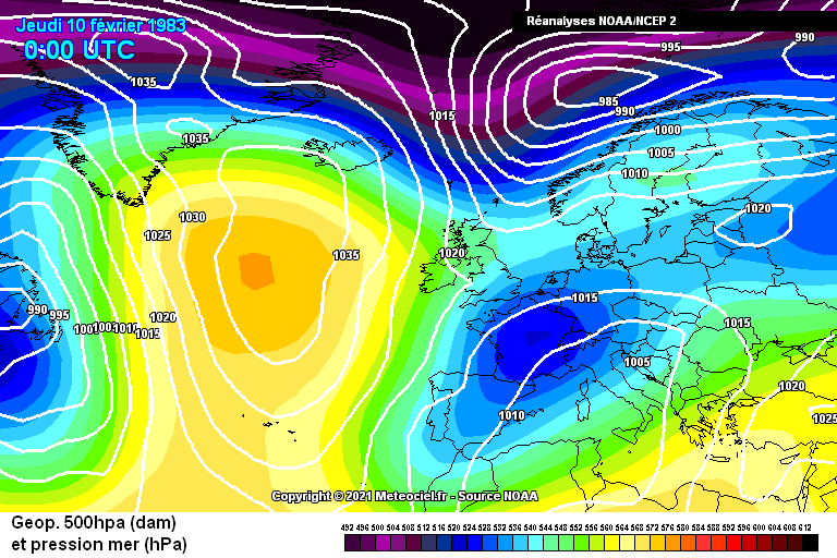
This is more interesting and, in line with some of the earlier comments, you can see a few stronger El Ninos associated with colder Februaries. The 3.4 region shows a lot more scatter while still trending slightly to warmer for the higher El Nino values. 1983 is a stand out particularly in the Nino 1+2 region data but 1889, 1942 and 1919 were sub-3C Februaries with +1 ENSO values. 1998 shows that exceptional warmth is still also a possibility. Here the ENSO data is for the preceding Nov - Jan.
NB: in all the above, the colour represents the 3.4 region in the 1+2 graphs, and vice versa to try and give an idea of which region the strongest ENSO values are located. eQBO is represented by a square, wQBO by a cross, though the data only goes back to 1979 so there's not much to go on here and earlier years are all represented by circles. I was just going to ask if there's any older QBO datasets when I saw @BruenSryan's post above - so will have to take a look!
-
1
-
2
-


Model Output Discussion - Spring Has Sprung
in Forecast Model Discussion
Posted
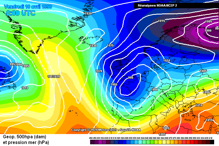
I've been looking at Aprils following some previous very strong El Nino events* and what's quite striking is the strong trough anomaly over the UK, which mirrors what we've seen recently, and the setup also looks similar to the charts @Cambrian has posted above for 10 days time with the high over Greenland and into the Altantic:
Rolling this forward to the summer and we get the high to the west of us - which is also something we've seen a bit of this week and in some of the models recently. If you look at the summers individually this masks a range of options and if the trough is closer to the UK it could be wetter, but if something like this was to verify it wouldn't be a bad summer for those of us in the west as long as the high stays close enough to the UK to be enough of an influence. It might not be as hot as some recent years though.
*looking at this 2023-24 has actually been classified as "strong" rather than very strong which these charts are based on, though: https://ggweather.com/enso/oni.htm
El Niño and La Niña Years and Intensities